_
ONVZ health insurance
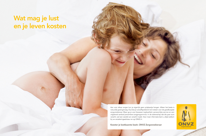
Cherish your most valuable asset
While working on the identity redesign, we also had to create a fall campaign to get new clients in and keep existing clients. ONVZ is certainly not the cheapest health insurance company but their coverage is the best. Your most valuable asset, your body is central in the campaign, and if you cherish it you want the best insurance you can afford. ONVZ clients come mostly from the mid level and higher incomes, they don't want any fuss but just a really good insurance.
The logo was a dark brown and almost neon yellow. ONVZ asked BSUR in the pitch and we quickly decided that the logo was still very relevant but needed updating. We changed the brown to a more business dark grey (stands for corporate excellence) and changed the neon like yellow to a warm (sunny) yellow (stands for the human approach). I created a fixed rounded square around the logo creating a badge which contains a circular gradient. The result is a logo in which a person is standing in the sun and it radiates, empowering the person.
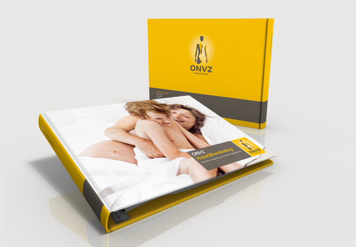
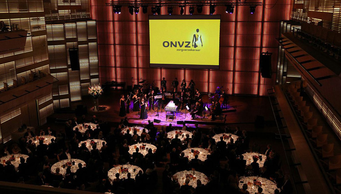
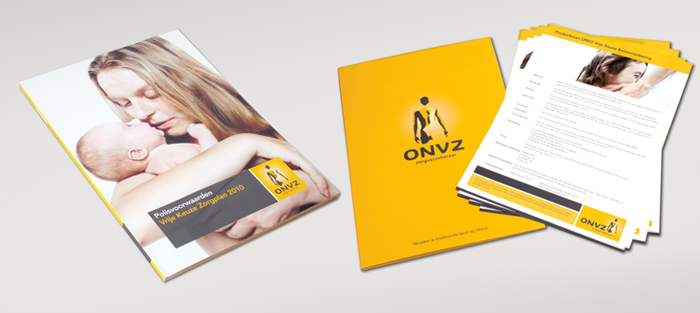
After proofing and the final approval of the logo I designed the first editions for all items ranging from flyers, business cards and brochures to the logo on the facing of the building. Making sure all items speak the same language. All these items were placed as examples in the brand manual to make sure that all future communications of the brand will be consistent.
_
CREDITS
Graphic Design
Robert-Jan Hoesman
Creative Team
Ro Mulder
Jurjen Born
Rob van Vijfeijken
Brand Photography
Wouter van den Brink
Execution Website
The Peoples Valley
Agency
BSUR Concepting